ETC/무작정따라하기
[HTML, CSS, JS] mousemove 이벤트 따라하기
chanCo
2022. 5. 17. 00:12
출처: litecode https://youtu.be/bfdEB5OiUwY
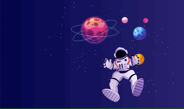
오늘은 마우스의 움직임 이벤트(onmousemove)에 따라 이미지가 움직이는 효과를 구현한 영상을 따라해봤다.
parallax에 관심이 많기 때문에 포폴이나 프로젝트에 간간히 쓸 수 있는 효과일 것 같다!
소스코드
<!DOCTYPE html>
<html lang="en">
<head>
  <meta charset="UTF-8">
  <meta http-equiv="X-UA-Compatible" content="IE=edge">
  <meta name="viewport" content="width=device-width, initial-scale=1.0">
  <title>Document</title>

  <style>
    * {
      margin: 0;
      padding: 0;
      box-sizing: border-box;
    }

    .container {
      position: relative;
      width: 100%;
      height: 100vh;
      overflow: hidden;
      background-image: linear-gradient(to right, #00014a, #281f6f);
    }

    .layer {
      position: absolute;
      top: 0;
      left: 0;
      width: 100%;
      height: 100%;
      background-position: right;
      background-size: cover;
    }

    .layer:nth-child(1) {
      background-image: url(./img/1.png);
    }
    .layer:nth-child(2) {
      background-image: url(./img/2.png);
    }
    .layer:nth-child(3) {
      background-image: url(./img/3.png);
    }
    .layer:nth-child(4) {
      background-image: url(./img/4.png);
    }
    .layer:nth-child(5) {
      background-image: url(./img/5.png);
    }
    .layer:nth-child(6) {
      background-image: url(./img/6.png);
    }
    .layer:nth-child(7) {
      background-image: url(./img/7.png);
    }

  </style>

</head>
<body>
  <div class="container">
    <div class="layer"></div>
    <div class="layer"></div>
    <div class="layer"></div>
    <div class="layer"></div>
    <div class="layer"></div>
    <div class="layer"></div>
    <div class="layer"></div>
  </div>

  <script type="text/javascript">

    let container = document.querySelector(".container");
    let layer = document.querySelectorAll(".layer");

    container.onmousemove = e => {
      let x = e.pageX;
      let y = e.pageY;

      layer[0].style.transform = `translate(${x/100*-7}px, ${y/100*-7}px`;
      layer[1].style.transform = `translate(${x/100*-6}px, ${y/100*-6}px`;
      layer[2].style.transform = `translate(${x/100*-3}px, ${y/100*-3}px`;
      layer[3].style.transform = `translate(${x/100*-1}px, ${y/100*-1}px`;
      layer[4].style.transform = `translate(${x/100*-3}px, ${y/100*-3}px`;
      layer[5].style.transform = `translate(${x/100*-7}px, ${y/100*-7}px`;
      layer[6].style.transform = `translate(${x/100*2}px, ${y/100*5}px`;
    }

  </script>
</body>
</html>
구현결과